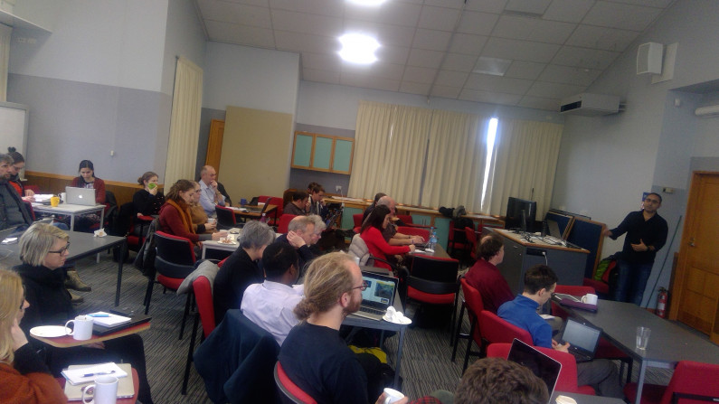
Stats NZ hosted a series of 2-day Data Visualization workshops – in conjunction with the recent Open Data Meetups – in Auckland, Christchurch, Wellington and Dunedin.
The workshops were an opportunity for the more than 180 participants to accelerate their skills by exploring new methods of presenting data in a compelling way.
Award-winning data journalist Harkanwal Singh, supported by Keith Ng, demonstrated how to present data in new and compelling ways, including:
"Excellent big picture view down to the practical"
"Provides a good overview of the different facets of visualising data with lots of links to resources for in-depth research"
"I learnt a lot even though I've been a data analyst for years. Was great value!”
“It was very useful for people who deal with quantitative data as this is not normally covered in data processing”.
Harkanwal and Keith have provided some useful resources and training material for data visualization tinyurl.com/elementsworkshop.
We thought you might be interested in where workshop participants source their data from …

Subscribe to our newsletter to find out about open data events, learn more about what the Stats NZ Open Data team is working on, and read about impactful reuse or new data releases.